
Poll: My Lebara app feedback

X
Collapse
14 replies
241 views
 
  • Time
  • Show
Clear All
new posts
    Community Manager 1
    Hi everyone,

    Following some recent changes the the the My Lebara app we'd be very interested in getting some feedback from our community members on how you'd prefer your usage history to be displayed.

    We have a several options that we would like your feedback on for viewing your usage in the app. You can use the poll below to let us know your preferred option for viewing your usage.
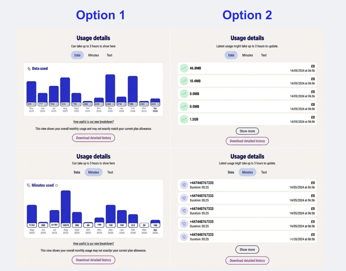


    If you have any additional comments or feedback about how your usage is displayed please let us know in the comments below.





    64
    Option 1 Bar chart
    40.63%
    26
    Option 2 Information list
    17.19%
    11
    Both options
    39.06%
    25
    Neither option
    3.13%
    2
    Martin - Community Manager

    14 replies

  • #2
    Junior Member
    I think it's totally easy to navigate the app

    Comment

    • #3
      Community Manager 1
      Thanks for the feedback SteveT10
      Martin - Community Manager

      Comment

      • #4
        Junior Member
        I presumed that option 1 would require me to review the data in landscape mode on my mobile. I prefer the "at a glance" information to decide if I need to investigate further. Lebara service is great and I recommend to anyone considering changing their mobile providor. Keep up the good work

        Comment

        • #5
          Junior Member
          I like to see the numbers called not just a summa

          Comment

          • #6
            Junior Member
            Those images are too small to view properly, but I can guess. Chrome on Win 11. Both options would be good.

            Comment

            • #7
              Junior Member
              Option 1 based on seeing the images very small on screen.

              Comment

              • #8
                Junior Member
                My preference is option 1 (voted this way) as I like to see the month by month usage for mins, text and data. Loving Lebara since I switched over, keep up the good work !!

                Comment

                • #9
                  Member
                  I agree,using the ‘Manhattan’ style of showing using is much more appealing visually. App upgrade has been great btw

                  Comment

                  • #10
                    Junior Member
                    Both options would be good

                    Comment

                    • #11
                      Junior Member
                      Hi yes don’t get rid of showing the numbers called that is the main thing to see an itemised list if you want to add bar graph as extra fair enough but the main who you called data and duration time etc should be there Thanks

                      Comment

                      • #12
                        Junior Member
                        What's missing is international minutes. Adding a line for the allowance would make it easier to compare against, when applicable. That may not help much if usage is way smaller than the allowance, so might need to be a bit creative, like only showing the allowance if within 20% or something like that
                        The progressive rendering of the bar chart is making it slow. Is that on purpose? May look cool on PowerPoint but it does not add anything for me, except waiting.
                        Option 2 is pointless. I get the point about itemised items, but then I would prefer a download as CSV or json if I wanted to drill down further.

                        JM

                        Comment

                        • #13
                          Junior Member
                          Martin, in fact, the bar chart gives the high-level summarised usage from a graphical perspective. BUT, it can no way provide itemised details, as was available earlier.
                          Hence, I would prefer both options - one for a granular and the other for summarized view. If only one is possible, i would opt for the itemised one, as that is of higher importance for me.

                          Comment

                          • #14
                            Junior Member
                            People who saying they like to see what number they called and how many minutes did they realized there is a detailed history download option just under it?

                            Comment

                            • #15
                              Junior Member
                              I had to select one option in the poll. Both options were too small to read. There was a magnifying glass icon, indicating that I could zoom in, but clicking did not zoom in.

                              Comment

                              Loading...